I often consider usability when using web applications, especially when I am the user. Our lovely state of North Carolina, is very tech savvy and has a lot of online resources and help. Did you know that North Carolina was one of the first states to have it’s own data center?
Today, I went online to change my address on my Driver License. Apparently there is some complication with my particular license (hopefully not a warrant out for my arrest 🙂 ) in the system and I need to go into a physical office for human assistance. As an application architect, I can see this is probably some poorly handled data condition. I can dig that, a computer can’t handle EVERYTHING…
What prompted this post was a bit of musing on proper error messages. When humans interact with computers, by definition there is a depersonalization to the process. This depersonalization can add a level of harshness or friction into the equation, altering the perception of the organization to the user. Allow me to pontificate…
I often stay at nice hotels. Nice hotels always have extremely polite front desk staff to help check guests in. The check-in phase of the hotel stay sets the stage for perception. If the registration desk is nicely furnished, elegant and staffed with ultra-polite staff, guests perceive the hotel as a nicely furnished, elegant and ultra-polite and this perception sticks with them the entire trip. If there is some reason why a request can not be accommodated, say I ask for a room on the top floor and the top floor has already been booked, the registration staff apologize effusively and find a suitable arrangement. Even if I asked for something impossible, like a helicopter to take my bags to my room, the staff would politely and softly apologize that such a service was not available, then offer the services of a bellman for bag delivery.
Hotels definitely understand the human touch. Computers do not. Nor do the engineers that create applications. See, it was perfectly acceptable for some reason or another not to provide algorithms suitable for handling an address change with my specific type of license. The engineer probably had a meeting discussing just such an occurrence and it was deemed not critical for the application. So the engineer dutifully put in code to catch such an occurrence and then added an error message to halt the flow of the application. The engineer considered the application from the perspective of the application and this is what was implemented:
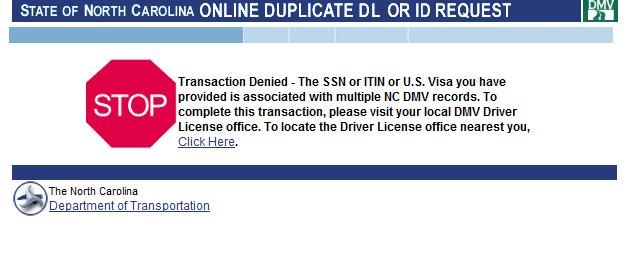
Ouch. Nothing like a BIG RED STOP SIGN.
STOP! It says.. The text, actually, isn’t half bad because it attempts to explain the issue, “…Multiple Address Records…” and offer to help me find the nearest office. But, I reeled from the impact of that stop sign.
To stick with the hotel analogy, it was as if I approached the registration desk, asked for a room with a King Sized bed, and the clerk said, “We have no king beds” then slapped me across the face, WACK!
I’m sure all of this seemed rather normal for the Application Engineer, who had undoubtedly seen this error page hundreds of times before during testing and was desensitized to it. Me, however, expecting to see a helpful page allowing me to change my address, was a little taken aback by the HONKING BIG RED STOP SIGN OF DOOM CLUBBING ME LIKE A BABY SEAL.
So, I mused a little bit this morning and made a decision to pay a little more attention to the human factor and to usability. I challenge you to do the same in your applications.
Do you have a screenshot example of a ridiculously insulting error message? Submit a link of the image to me and I’ll post it here for the amusement of others…